Green River White Paper

Better Maps

A methodology for creating granular—yet anonymized—topologies of disease

Michael Knapp, Ph.D., M.E.M.
Chief Executive Officer, Green River Data Analysis, Inc.

Todd Blackman, M.S., B.S.
Software Engineer, Green River Data Analysis, Inc.

Matthew Muspratt, J.D., M.E.M.
Data and Science Writer, Green River Data Analysis, Inc.

Acknowledgements

Much of Green River’s work with the heat maps and animations described in this white paper has been conducted for the Delaware Department of Health and Social Services (DHSS), in particular the agency’s My Healthy Community public health data platform. [1] The authors are grateful to their DHSS colleagues for their collaboration and especially thank state epidemiologist Dr. Tabatha Offutt-Powell and former Public Health Informatics Bureau chief Marcy Parykaza for the opportunity to apply this mapping methodology and technology in a comprehensive, public-facing environment. Many of the examples presented herein derive from Green River’s work with DHSS. Previously, foundational work in the methodology discussed was conducted and presented in various fora by one author—Michael Knapp—in collaboration with Gary V. Archambault of the Connecticut Department of Public Health. [2] Finally, the authors wish to recognize Professor Emeritus Gerard Rushton of the University of Iowa, whose work in spatial analysis of health was instrumental in the development of the authors’ methodology and technology. [3]

Abstract

“Heat maps” are compelling information visualizations capable of simplifying complex statistical phenomena occurring over space and time. Applied to the public health context, they can render patterns of disease and health in highly accessible form, but must contend with the imperative of preserving privacy—to be useful, heat maps must display health event rates granularly while simultaneously preserving the anonymity of the individuals associated with those events. This white paper summarizes the authors’ methodology for producing such maps—anonymized public health visualizations that meet the privacy standards of the U.S. Health Insurance Portability and Accountability Act of 1996 (HIPAA). The paper also describes how the authors’ technique evades the modifiable areal unit problem (MAUP) that biases choropleth maps, as well as a rate-smoothing process to mitigate the misleading “overrepresentation” of large, low-density regions in geospatial visualizations of health topics. A step-by-step description of the authors’ mapmaking process explains how a dense lattice of points is employed to calculate rates, test for anonymity, definite color gradients, and generate final heat map animations.

Introduction

This is not a trick question: Which of the following maps tells us more about COVID-19?

Also not a trick question: Which of the following animations tells us more about COVID-19?

New COVID-19 Cases

Both Map A and Map B employ color shading to indicate data values in a particular geographic area—in this case, the rates of new COVID-19 cases across the U.S. state of Delaware for a specific time period. Both Animation A and Animation B stitch together a sequence of such graphics to illustrate how those rates have changed over the span of six weeks. Both map and animation pairs therefore ably tell us about COVID-19 prevalence across space and time. But Map B and Animation B almost certainly strike most observers as more telling than the A alternatives.

The Bs are “heat maps,” surface models that describe COVID-19 cases irrespective of any political or geographic boundary (aside from the contextual outline of Delaware’s border). The As are “choropleth maps,” which also describe COVID-19 spatially, but according to ZIP Code, an administratively drawn boundary that is simultaneously coarse and, in terms of virus transmission, arbitrary. There may be occasion to visualize disease and health by geopolitical region—bird’s-eye comparisons by state can be valuable; county demarcations may govern public budgets and operations—but heat maps and animations like the above examples offer significant comparative advantages as public health tools. Their hue gradations finely and continuously illustrate rate variation. Their boundary-independence reflects the apolitical nature of pathogen transmission (not to mention that of non-infectious conditions, including environmental diseases, which likewise afflict without respect to ZIP Code contours).

Moreover, heat maps are a compelling information visualization technique. They simplify highly complex statistical phenomena occurring over spatial and temporal dimensions, thereby enabling the public to observe trends and intuit the difference between clusters and random occurrences with the naked eye. These data and analyses are often challenging for the public health community to explain to lay audiences.

Heat maps boast additional strengths, and choropleth maps are problematic for other reasons—and we will consider these below—but let us first return to a similarity between the As and Bs. The A and B visualizations above share an important feature in common: They are derived from the very same dataset, [4] and that dataset contains names, addresses, and personal health information that law and civil liberty sensibilities demand be kept confidential. Both choropleth and heat maps can preserve privacy, but a visualization that does so while remaining detailed and informative is especially useful to the public health field.

How we—developers at Green River, an impact-focused software and analytics firm based in Brattleboro, Vermont—get from A to B is the subject of this white paper. More accurately, we describe how we go from zero to B: how our software converts raw data containing discrete personal details and corresponding COVID-19 test results (or any health event) into anonymized public health visualizations like Map B and Animation B. Our process stands as one solution to an ongoing conundrum in public health and public health communication: How do we visually present patterns of disease and health at a granularity that is useful while simultaneously preserving anonymity?

Compliance with the HIPAA Privacy Rule

The public needs and wants to know about health risks in their immediate vicinity, whether it concerns COVID-19, or drinking water quality, or cancers, or opioid use disorder, or any number of health threats, events, and outcomes. Maps are an excellent tool for communicating such information to a broad audience, not least because visual representations are more accessible than endless rows and endless columns of data. Tables, bar charts, trend lines, and other plotting techniques can convert datasets to digestible graphics, but they generally lack a spatial axis, a geographic dimension by which the lay observer can understand where and when health events are occuring, and whether they are occurring in concert, randomly, or otherwise.

And yet, just as law and ethics proscribe publishing a table of personal addresses and health conditions, so too our visualizations cannot simply drop pins on a map. Made public, such a map would be unacceptably invasive and, for most handlers of health data, against the law. Confoundingly, even anonymizing a dataset’s key identifying variables is frequently insufficient to preserve privacy. As Laranya Sweeney of Harvard University has shown, ZIP Code, gender, and birthday is enough information to uniquely identify nearly 90 percent of Americans. [5]

In the U.S., most use and disclosure of health information must employ de-identification methods that meet a standard under the Health Insurance Portability and Accountability Act of 1996, or HIPAA. The act’s Privacy Rule, expressed in 45 C.F.R. § 164.514(b) Implementation specifications: Requirements for de-identification of protected health information, deems “health information” (a comprehensive term spanning an individual’s condition, care, and health expenses) to be “not individually identifiable… only if… the risk is very small that the information could be used, alone or in combination with other reasonably available information, by an anticipated recipient to identify an individual who is a subject of the information.” [6]

The anonymized heat maps Green River develops—the methodology described below—meet this standard. In 2020, to ascertain the adequacy of our process, Green River retained consultants [7] equipped with, per HIPAA, “appropriate knowledge of and experience with generally accepted statistical and scientific principles and methods for rendering information not individually identifiable.” [8] Their review, performed to HIPAA-certify the data and algorithms underpinning a public health portal Green River developed for the Delaware Department of Health and Social Services, concluded that “the risk is very small that an individual who is subject to the information could be identified by a user of the [platform].” [9]

In brief, to comply with HIPAA, our statistical methodology and our mapmaking process (i) satisfies the obvious prohibition against using “direct identifiers” (e.g. names, telephone numbers) to produce data and reports and (ii) implements a requirement that “indirect identifiers” (non-unique attributes) or combinations thereof meet an acceptable (k, p)-anonymity rule, which establishes minimum counts and threshold fractions for population groups under investigation. A separate white paper detailing Green River’s application of the (k, p)-anonymity technique to public health data is forthcoming,[10] though the general principle is at work in the mapmaking process described below.

There are, of course, many ways to ensure maps comply with HIPAA. Indeed, presenting data in informative-yet-anonymized forms is a much-studied pursuit.[11] Choropleth maps, by selecting convenient (i.e. large enough) geographic unit sizes or aggregating and suppressing counts, can readily satisfy HIPAA requirements. Yet, as suggested above, such maps may come off as chunky, the pattern of disease patterns too coarse to be of much actionable insight. More problematic, choropleth maps suffer from an unavoidable bias tied to their geographical divisionsing—we consider how, and other common mapping challenges vis-à-vis heat maps, below.

Nonsusceptibility to the MAUP

Beyond HIPAA and preserving confidentiality, the technique Green River uses to build heat maps resolves other complications common to geospatial visualization of health topics.

One such challenge is the modifiable areal unit problem, or MAUP, a bias to which choropleth maps are particularly prone. The MAUP, in short, indicates that choropleth maps can be misleading because the patterns they display are in fact determined by the geopolitical unit chosen for data aggregation (e.g. ZIP Code, census tract, congressional district, county, etc.). In other words, because choropleth maps are grouping events (numerators) and populations (denominators) to calculate and illustrate rates (numerators/denominators), exactly how those events and populations are grouped—where the mapmaker draws the lines—dictates which events are associated with which populations and therefore also dictates the rates and corresponding choropleth visualization.

As a blunt example, consider the figure below, which we could imagine depicts a territory of 144 evenly distributed residents (one person per square), 24 of whom are afflicted with a particular health condition (denoted with an X) for a territory-wide rate of 24/144, or 16.7 percent:

A mapmaker might seek to illustrate the disease pattern occurring in this territory with a choropleth map, but the map’s hue pattern would depend entirely on how the mapmaker aggregates the data—that is, on which geographic grouping unit the mapmaker chooses. Below are four possible choropleth maps the mapmaker might produce based on four different methods of carving up the territory. All four methods aggregate the 144 residents into 12 areas of equal area and population, and we could imagine each represents a different geopolitical divisioning, such as ZIP Code, census tract, congressional district, and school district:

To the extent these choropleths each roughly capture the disease pattern under investigation, observers could easily make conflicting conjectures about the pattern depending on which map they were viewing. The “ZIP Code” and “census tract” maps imply a significant hotspot, with segments of the population exhibiting a 92 percent affliction rate; the “congressional district” map suggests the condition is more pronounced in the territory’s western reaches, while the “school district” map places the trend in the north.

The MAUP enables these different conclusions even though all four choropleths draw from the very same underlying distribution of 24 health cases. Similarly, when we compare maps of COVID-19 vaccination rates in Delaware by ZIP Code and census tract, our understanding of precisely where rates are high and low is also inconsistent—this is especially noticeable in the state’s southeast corner. The true pattern is elusive because the geographic unit of aggregation biases the pattern we experience: [12]

The process by which Green River derives rates for our heat maps, on the other hand, evades the MAUP. As described in detail below, the methodology defines event and population groups irrespective of geopolitical boundaries. Aggregation is instead governed by proximity to lattice points uniformly distributed across the desired map area. This yields a depiction of the true underlying disease pattern not subject to the MAUP.

Smoothing Rates to Mitigate Visual Misperceptions

Another challenge in visualizing disease is that, ideally, health data should be conveyed per unit population, not per unit geographic area. The challenge manifests in at least two (related) ways: Maps can mislead viewers regarding the “footprint” of a disease across geographies of varying size and density; Rates in rural areas are more unstable than rates in densely populated spaces due to their lower population denominators.

Because rural areas typically occupy larger physical space than urban population centers, the eye can misperceive both the big picture and the local picture by incorrectly assuming rural areas are impacting the overall public health situation more than they are. Dark red may denote a particular disease rate, but dark red across the 8,000 square miles of lightly populated Carbon County, Wyoming, means one thing, while dark red over New York City means something else—yet, on a map, Carbon County occupies significantly more real estate.

The general public has more exposure to this complication than to the MAUP, albeit in a different context: electoral maps. The oft-raised complaint about electoral maps is that they depict vast areas of land siding with one candidate or another when those spaces actually contain comparatively few voters, thereby overstating the influence of that area on the total vote count. The visualization below from Belgian designer Karim Douïeb makes the point by morphing a conventional land-based U.S. county electoral map into a population-based one that represents county vote totals by circle size: [13]

Screenshots from Karim Douïeb’s animation transitioning between land-based and population-based county vote maps [14]

(Note that both versions are subject to the MAUP—their patterns are determined by the grouping of votes by county. Charts displaying the same vote totals by ZIP Code, state, or Congressional district would present differing patterns whether they employed shading or population circles.)

Map-stretching techniques—collapsing less dense areas, expanding urban centers—are another way to solve this visual misperception. University of Michigan professor Mark Newman has applied such “density-equalizing” methods in both the electoral and public health contexts:

2016 U.S. presidential election results by county [15]
Lung cancer cases among males in the State of New York, 1993–1997 [16]

A clear shortcoming of these visualizations, however, is that they are confusing to the reader. The resulting maps are deformed and unfamiliar—do the above images resemble the United States and New York?—and they no longer correspond to geographic reality.

Rather than resort to such distortions, Green River’s heat map visualizations accept the potential of rural areas to mislead but address the issue of rural rate instability in order to mitigate misperceptions. The issue is that an additional 150 COVID-19 cases among the 15,000 people of Carbon County (1 percent of the population) means one thing for the larger coronavirus picture—probably not much, on its own—while an additional 84,000 cases among New York City’s 8.4 million denizens (also 1 percent) means something else entirely—a consequential urban public health situation. We want our animations to reflect this subtlety and minimize the appearance of heat map spikes or spots in low-density regions when a change in the number of events does not have the broad public health impact the visual might imply or does not involve enough events to be attributable to anything but chance. (A fluctuation of a couple of cases in Carbon County will occur by chance; a fluctuation of a proportionally similar 1,100 cases in New York City will not be due to chance alone.)

To achieve this, we in essence increase rate denominators. Our animated heat maps employ a smoothing technique that calculates disease rates in rural regions over larger geographic areas and, therefore, larger populations. By “borrowing” population and events from nearby, the local rates in rural areas approach a stability resembling those of more densely populated areas. Our heat map visualizations correspondingly reflect that stability.

In short, public health is concerned with populations, not geography. Our smoothing technique ensures changes in heat map hues are meaningful whether they occur in urban, peri-urban, or rural areas. Again, details of our approach, including the rate binning conventions behind hue gradations, are described below.

Building Green River's Animated Maps

Our method for processing raw data into animated maps is fairly involved and, necessarily, computationally intensive. For one, we are mapping rates, not counts. And because our method eschews geopolitical boundaries like ZIP Codes and census tracts (whose population totals are easily accessed but invoke the MAUP), our software must perform numerous, complex, and iterative calculations applying spatial data and geographic information system (GIS) tools to census data stores in order to compute rate denominators and gather corresponding numerator event counts.Further, the strength of Green River’s heat map animations lies less in conveying specific rates—a simple table or chart can do that—and more in graphically depicting rate changes over space and time while simultaneously preserving anonymity. Generating rates that meet the HIPAA Privacy Rule standard and yet which are changing over space and time is a computationally iterative process—and far more intensive than the basic tabular binning and color scaling of a choropleth.

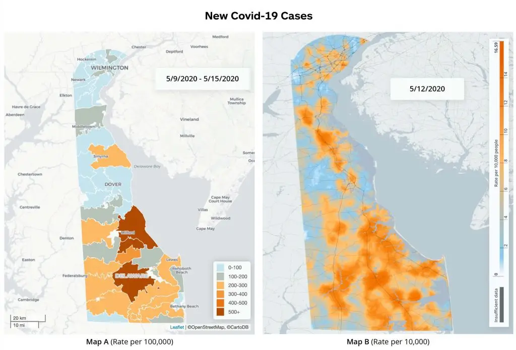
Below we outline the key steps of our process:

  1. Our heat map is composed of a large set of points, each assigned xy, and z values where x and y are the point’s longitudinal and latitudinal coordinates and z represents the rate under investigation (e.g. rate of positive COVID-19 cases) calculated for that point. z will correspond to a particular color hue on a color gradient in the final heat map.

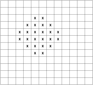
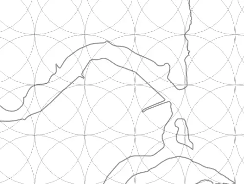
    The first step is the generation of a lattice of these points, equally spaced and covering the map extent. The precise spacing is discretionary, but involves a trade-off: A dense lattice may yield greater granularity in high-population regions, but will elevate computer processing demand; a less dense lattice requires less processing power, but in the extreme might pixelate to a coarseness resembling a choropleth. In the case of the above Delaware imagery, the initial spacing between points is 0.004 degrees.

  2. At each lattice point, a circle is initialized with a radius equal to the point spacing, which ensures that the circumference of a given lattice point’s circle touches the four closest points to its north, south, east, and west, and that the entire map surface is covered by at least once circle. [17]

    Sample map with entire surface covered by at least one circle

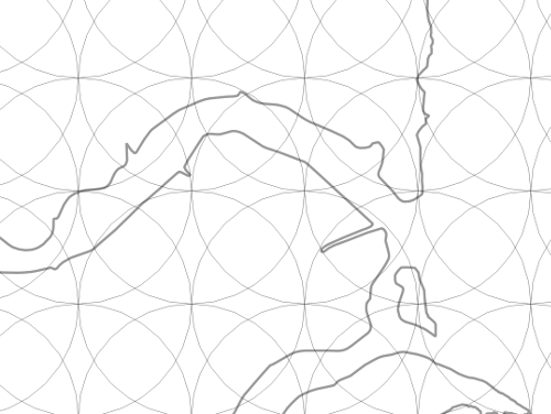
  3. The lattice is populated with event locations (e.g. the address of an individual with a positive COVID-19 case), which are each “snapped” from their true location to the nearest lattice point.”Snapping” serves only as a component of our HIPAA-compliant anonymization process. It is not required for calculating rates or generating heat maps and is a step that could be outright skipped in mapping contexts where privacy is of no concern.

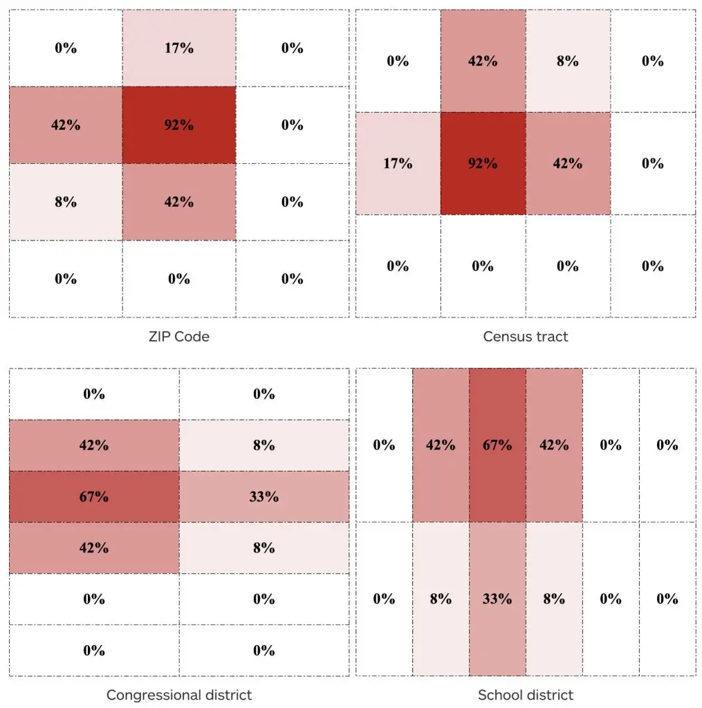
  4. An anonymity test is performed based on event rates within circles. For each circle’s associated lattice point a rate is assigned as determined by:
    • the number of events within the point’s associated circle (the rate’s numerator), and
    • a total population (the rate’s denominator), an estimate based on the circle’s area and census data.

    In general, a population estimate of ≥ 500 people and an event count of either 0 or ≥ 5 is sufficient for a circle to be considered anonymous as long as the resulting rate is less than 90 percent. [18] If a circle is not sufficiently anonymous, its size is increased to cover the next closest lattice points and the rate re-calculated. [19] At this point, either:

    • the rate for the lattice point satisfies the test for sufficient anonymity, or,
    • a nil value is assigned for the point’s rate after n iterations of circle expansion, with n determined experimentally. [20]

    An important consequence of this process is that the events snapped to any given lattice point may count towards the rate calculation in more than one circle (and therefore be represented in the calculated rates of more than one lattice point). This means that every pixel in the final heat map represents information gathered from the surrounding area.

    (Note also that, for map extents with varying population densities, the circle expansion process also executes the smoothing technique described above—circle expansion increases rate denominators, thereby lending rural rates a stability closer to those of denser regions, which in turn will minimize misleading or distracting hue fluctuations in heat map animations.

  5. At this stage, the process has yielded a collection of circles, each with a lattice point that has been assigned nil or a number between 0 and 1 representing a rate.

  6. The above process is repeated for each time period that data is available. (The static map derived from each time period in later steps will comprise a frame in the final heat map animation.)

  7. To assign colors to rates (i.e., the z value for each point), the full set of calculated rates across all time periods is binned into deciles and a color scale chosen to represent the entire range. The set is modified—and the standard definition of decile is deviated from—in a few ways:

    • Zero rates are counted only once in a set to maximize the color range. (Otherwise, zeros, if common across the map, would consume most of the color gradient.)

    • The lowest and highest 2 percent of values are excluded from the set in order to reduce the impact of outliers on the color gradient.

    • The floor of the lowest bin is defined as zero regardless of the lowest value in the set.

    An off-gradient color (e.g. gray) is assigned to rates with a nil value (meaning, again, the lattice point and associated circle did not reach sufficient anonymity).

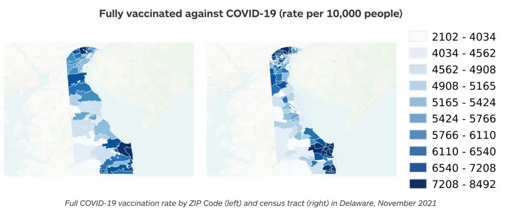
  8. Because the lattice points themselves are not sufficiently numerous and dense to constitute a high-resolution heat map, a smoothing technique called inverse distance weighted (IDW) interpolation is applied for each time period to generate additional points (i.e. pixels) between all lattice points, each with their own z value (and associated color) interpolated according to neighbors’ values.

    In this step, upon IDW interpolation, point data has effectively been converted to a true, static heat map for each time period—a rasterized image colored with the scale determined from the deciles described above.

    (The smoothing process in this step also provides an additional layer of anonymity. For example, in the case of a single high-rate lattice point surrounded by zero-rate points, the smoothing would “blur” the distinctive rate by generating points of intermediary rates nearby. Where a map contains areas of high population density with relatively few events, this smoothing also ensures the visualization does not imply the few events are more likely to occur on one neighborhood block than another.)

  9. Because time intervals in public health data are typically quite long—data might be collected on a monthly, yearly, or every-five-years basis—the above process typically results in only a few static heat maps, which yields a choppy animation when strung together in sequence. To create a fluid animation, another interpolation technique generates n additional, intermediate frames by estimating rates at each lattice point (i.e.z values) based on the known z values at the known time intervals. The number of additional frames, n, is determined by balancing processing power limitations and the frame rate required to produce a sufficiently fluid animation experience.
Sample map with entire surface covered by at least one circle

Conclusion

Public health—and fields far and wide—wrestle with how to effectively communicate data to both expert and lay audiences, a question in no way simplified when narrowed to visual communication like graphs, trend lines, and, of course, maps. As a discipline intrinsically concerned with trends in disease across space and time, public health can and does make especially powerful use of maps, but faces the additional imperative of preserving individual privacy. We believe the heat maps Green River develops (the animations in particular) offer not just a strong solution, but have the potential to equip public health’s intended audience—citizens—with a significant tool for understanding their wellbeing.

Heat maps are not without shortcomings and limitations. Despite our rate smoothing technique, the potential of viewers to misperceive the contribution of rural event rates to an overall disease burden remains. Depending on the subject matter under investigation, heat maps may obscure or mislead in questions of causation. A heat map of lung cancer rates, for example, would be overwhelmingly influenced by cases of smoking and secondhand smoke exposure, making the tool largely unhelpful as a means to investigate other causes. (Conversely, certain other cancer types might render as persistent, crystal clear clusters in the environs of a particular industrial workplace.) Further, the application of heat maps is largely confined to surveillance methodologies and ecological analyses—frameworks involving systematic data collection, populations, and broad pattern detection. They are a far less relevant tool for cohort and case-control studies, for instance.

In sum, the utility of heat maps like the ones included in this paper and those published on the State of Delaware’s My Healthy Community platform stems from their robust depiction of disease across space and time. The underlying surveillance data in raw, relational spreadsheet form would be effectively useless to the naked eye; even considerable statistical analysis would be unlikely to match the efficiency of a heat map in exposing hotspots and patterns detectable by the human eye. As discussed, choropleth maps suffer from a bias whereby apparent trends are possibly artifacts of the geopolitical unit the mapmaker chose to group events and populations. Plotting public health data as described in this white paper, on the other hand, represents a MAUP-free technique for granularly investigating patterns of disease and health, while preserving confidentiality to HIPAA standards.

Footnotes

[1] Delaware Department of Health and Social Services, My Healthy Community, https://myhealthycommunity.dhss.delaware.gov/locations/state.

[2] See, e.g., Knapp, M. & Archambault, G.V. (2000, November 12-16). “Using GIS to create an integrated data warehouse for environmental health surveillance” [Presentation]. The 128th Annual Meeting of American Public Health Association, 2000, Boston, MA. https://apha.confex.com/apha/128am/techprogram/paper_10057.htm.

[3] See, e.g., Richards, Thomas & Croner, Charles & Rushton, Gerard & Brown, Carol & Fowler, Littleton. (1999). Information Technology: Geographic Information Systems and Public Health: Mapping the Future. Public Health Reports. 114: 359-73. https://www.researchgate.net/publication/12799514_Information_Technology_Geographic_Information_Systems_and_Public_Health_Mapping_the_Future.; Rushton, Gerard & Krishnamurti, Diane & Krishnamurthy, R. & Song, Hu. (1995). A geographic information analysis of urban infant mortality rates. International Journal of Geographical Information Science – GIS. 5. https://www.researchgate.net/publication/244956722_A_geographic_information_analysis_of_urban_infant_mortality_rates.

[4] Note that while both sets of visualizations are displaying rates of new COVID-19 cases across the same time period—and both sets derive from the same dataset—neither are displaying rates from a single day and, relatedly, these particular choropleth and heat maps employ different multi-day averaging conventions. The result is two sets of visualizations that are not perfectly comparable in terms of the rates displayed for a particular day, but which nonetheless suitably demonstrate the contrasting granularity and patterns of these distinct plotting tools.

[5] Sweeney, L., Simple Demographics Often Identify People Uniquely. Carnegie Mellon University, Data Privacy Working Paper 3, Pittsburgh 2000. https://dataprivacylab.org/projects/identifiability/paper1.pdf.

[6] 45 C.F.R. § 164.514(b) Implementation specifications: Requirements for de-identification of protected health information. https://www.law.cornell.edu/cfr/text/45/164.514. The law applies to “covered entities,” which include healthcare providers, health plans, healthcare clearinghouses, and “business associates,” a term that spans a broad range of data handlers and their subcontractors.

[7] Fritz Scheuren, Ph.D. and Patrick Baier, D.Phil.

[8] 45 C.F.R. § 164.514(b)(1).

[9] Scheuren, F. and Baier, P. (2020). HIPAA Certification for Green River Data Analysis, LLC. On file with the authors.

[10] Please visit https://www.greenriver.com/blog for the latest white papers from Green River.

[11] See, e.g., Harvard University, Harvard University Privacy Tools Project, https://privacytools.seas.harvard.edu/differential-privacy.

[12] Another illustration of the MAUP comes from politics and the practice of “gerrymandering,” whereby boundaries of voting districts are drawn to advantage one political party or another. See, e.g., Ingraham, Christopher, “This is the best explanation of gerrymandering you will ever see,” The Washington Post Wonk Blog, March 1, 2015, https://www.washingtonpost.com/news/wonk/wp/2015/03/01/this-is-the-best-explanation-of-gerrymandering-you-will-ever-see/; Buzzelli M. (2020). Modifiable Areal Unit Problem. International Encyclopedia of Human Geography, 169–173. https://doi.org/10.1016/B978-0-08-102295-5.10406-8.

[13] Wilson, Mark. (2020). U.S. election maps are wildly misleading, so this designer fixed them. Fast Company. https://www.fastcompany.com/90572489/u-s-election-maps-are-wildly-misleading-so-this-designer-fixed-them.

[14] The original Twitter thread discussing Douïeb’s animation is at https://twitter.com/karim_douieb/status/1181695687005745153.

[15] Newman, Mark, Maps of the 2016 US presidential election results, http://www-personal.umich.edu/~mejn/election/2016/.

[16] Gastner, Michael T. and M.E.J. Newman. Diffusion-based method for producing density-equalizing maps. Proceedings of the National Academy of Sciences May 2004, 101 (20) 7499-7504; DOI: 10.1073/pnas.0400280101. https://www.pnas.org/content/101/20/7499.

[17] The word “circle” is being used to refer to a curved surface of equal distance in degrees from a given lattice point.

[18] Identification of individuals is more feasible at rate extremes. A 450/500 (90 percent) rate discloses that nearly everyone in a location associates with the investigated condition; a 1/500 rate exposes an individual to the re-identifying techniques and probabilities that Sweeney discusses.

[19] Expansion to the next closest lattice points is, again, a concession to HIPAA compliance and the “snapping” of events to lattice points in step 3. In contexts with less stringent privacy concerns, where events remain located at their original coordinates, circle expansion can progress more conservatively by expanding only to encompass the next closest event before re-calculating.

[20] Depending on the event and population being investigated, large circles may return rate information of little use; a map generated from only a few large circles will lack the granularity these visualizations are meant to achieve.

Green River

White Papers

HIPAA Checker

Protecting privacy in the neighborhood-level release of health information: An algorithm for publishing localized health data in compliance with HIPAA